Kyoroichi Graphics Bro~
+7
Breaker
Rikudo
TheRiceNigger
Chup'
Noverz
Kisagi
Kyoroichi
11 posters
:: AMV & Graphics :: Graphics
Page 2 of 2
Page 2 of 2 •  1, 2
1, 2
 Re: Kyoroichi Graphics Bro~
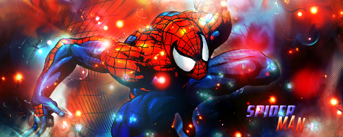
spoder mang pls

Breaker- Nero Team

- Posts : 262
Join date : 2013-04-19
Age : 27
Location : Yorozuya
 Re: Kyoroichi Graphics Bro~
yeah, as of lately im trying to focus on improving my font placement and looks aha
 Re: Kyoroichi Graphics Bro~
Pretty nice! You're getting much better
This might help with text
http://www.deviantart.com/art/Text-and-Fonts-Tutorial-123773229
This might help with text
http://www.deviantart.com/art/Text-and-Fonts-Tutorial-123773229
 Re: Kyoroichi Graphics Bro~
Yo Chris!
you're making progress!
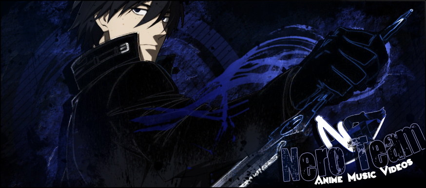
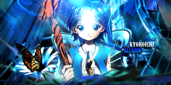
typography of the first banner is good! by against the other two banners are a review inlay can be further improved, have you tried the technique to smooth smudge effective inlays? I think it will permit you to improve this problem.
You could also try to fill benefit you're up to make them look less empty, but it will get better with time!
-Keep it up!
Noverz- Nero Team

- Posts : 37
Join date : 2013-08-24
 Re: Kyoroichi Graphics Bro~
thanks both of you! really cool tutorial you linked kisagi, it'll help me!
and flook I'll try your suggestion ^^
and flook I'll try your suggestion ^^
 Re: Kyoroichi Graphics Bro~
Yo chris you are improving with your graphics. But one problem still remains, there is not enough disney.
 Re: Kyoroichi Graphics Bro~
I see you like using C4Ds... Be careful with them even though they look cool they can cause your entire visualization to look random. So when placing them try putting it where it is noticeable, but not too noticeable that it would cause a distort. Then with your brushes to make the lights try lowering the opacity so it will not look like you just randomly placed a brush in, it's supposed to make it brighter not it's own thing.
In the first one it looks nice, but the C4D needs a better placement imo. Then the second one with the C4D it looks very random especially with the brushes.
Keep it up, nice improvement! Your style needs a bit more work though
In the first one it looks nice, but the C4D needs a better placement imo. Then the second one with the C4D it looks very random especially with the brushes.
Keep it up, nice improvement! Your style needs a bit more work though
 Re: Kyoroichi Graphics Bro~
Chris OP!

xChromez- Nero Team

- Posts : 80
Join date : 2013-08-11
Age : 28
Location : Australia
 Re: Kyoroichi Graphics Bro~
you should do attention for typography, rendering is too fuzzy , it would use the transfer curves degraded to improve all this
continuous like that!
continuous like that!

Noverz- Nero Team

- Posts : 37
Join date : 2013-08-24
Page 2 of 2 •  1, 2
1, 2
 Similar topics
» Light [Graphics]
» xMie [Graphics]
» UniqueDazZzle [Graphics]
» RealShinteki's Graphics :O
» Neno [Graphics]
» xMie [Graphics]
» UniqueDazZzle [Graphics]
» RealShinteki's Graphics :O
» Neno [Graphics]
:: AMV & Graphics :: Graphics
Page 2 of 2
Permissions in this forum:
You cannot reply to topics in this forum